When might a company decide that web usability is a bad thing?
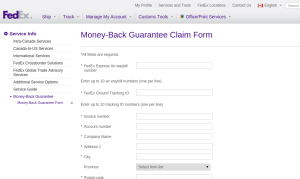
If I were a conspiracy theorist, I’d suggest that companies deliberately sabotage forms for tasks like refund requests, to discourage user conversion. Practically speaking, however, I think it’s more a matter of just not bothering to invest in them past the alpha stage. Consider FedEx Canada’s refund form:
https://www.fedex.com/ca_english/services/moneyback-claimform.html
Every field on this form is required, even though many of them won’t apply (e.g. you might not have your own invoice number associated with the shipment, and you almost certainly won’t have a fax number), and some are actually contradictory (you will have either a FedEx Express Air waybill number or a FedEx Ground Tracking ID, but not both).
On a higher level, nothing in the form makes it clear whether you’re filling in your address or the address to which you were sending the package. Flip a coin!
Fortunately, the form also doesn’t bother with data-type validation, so I was able to put “n/a” in all the fields that didn’t apply (1995 called and took away my fax machine), and I was able to guess that they wanted my address, based on the presence of a picklist for Canadian provinces.
If you’re an enterprising soul, you might consider setting up shop as a Web Unusability consultant, to help companies find ways to keep customers from filling out unwelcome forms.
 “As discussion of a failure grows longer, the probability of a comparison involving my action at Waterloo approaches 1—that is, if such discourse should persist for a sufficient period, be assured that some self-styled wit will compare someone or something to the second fall of the Corsican Tyrant.”


