No one would mistake me for a graphic designer — I believe that no merely visual design can match the breathtaking beauty of a properly-normalized database schema — but still, I recently found myself helping someone design a simple theme for a Drupal web site.
The site owner was visually-focussed (poor woman, stuck with me as designer!), and had very specific ideas about where layout items and whitespace should go, so I decided that while I have issues with fixed-width layouts like the [in]famous 960 grid, I shouldn’t make her suffer for my beliefs: I designed a fixed-width, em-based layout for her.
Two weeks later, she got in touch and said “I’m really sorry, but …”. She had been looking at the web site on a laptop up to that point, but the first time she opened it on her big monitor at work, it looked like garbage, a tiny strip surrounded by huge bands of whitespace.
Window size: an obsolete problem?
I mention this story because I just read a web page that suggests that fluid layouts — web-page layouts that adjust themselves to fit the width of the browser window — are passé:
With the advancement in displays and the cheap prices of large 22″ and 24″ displays fluid layouts have quickly become more a hinderance than a help because you don’t run your browser full screen anymore. You generally run your browser alongside your mail client, your IM client, iTunes, etc. You find a common size for your browser that accommodates most sites, and you leave it at that width.
Well, apparently not. At least, not in this case. The argument seems to be that users will conform to the needs of designers, by carefully resizing their browser windows to make the designs look good, but the web site owner I’m working with wasn’t one of those people, and I suspect that not all her visitors will be, either.
Rogues’ gallery
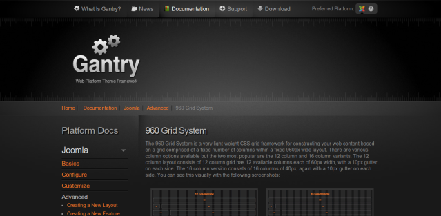
The designer of the web site proclaiming the demise of fluid layout probably hoped his or her site would look like this:
This is what you’d see on a typical laptop screen, or on a window sized smaller on a big screen. It’s beautiful — I freely admit that I could never design such a nice-looking web site.
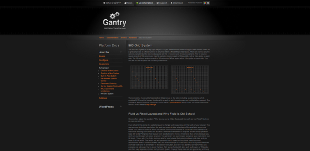
Now, here’s how the same site would look in a large browser window on a large monitor:
OK, even I (and probably my guinea pig) can design something nicer-looking than that. Damn those uncooperative users! Why do they forget to size their browser windows properly?
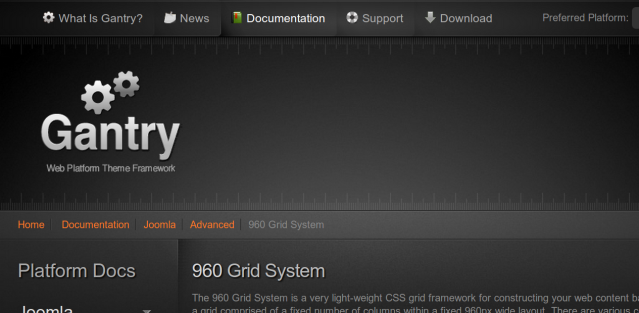
Now, let’s go down-market, and see how the same site might look in a browser window on a tiny netbook (where the user doesn’t have the option of choosing a bigger window size):
Not nearly as bad as the big screen, but awkward — I can sort-of see what the designer was trying to do, but I have to scroll around to get the whole effect: it’s like looking at the Mona Lisa in 5 cm² segments.
Fluid vs fixed-width is a trade-off
I’m not going to conclude by saying “fixed-width bad, fluid layout good”, or any such oversimplification, but instead, to suggest that the tradeoff that existed between the two ten years ago still exists today:
- If you want a web site that’s a respectable B- in a wide range of screen sizes, use a fluid layout (it’s not an accident that that’s what popular sites like Google use).
- If you want a web site that’s a spectacular A+ in one screen size, and a dismal D- in all others, use a fixed-width layout.
If you need to demonstrate that you are capable of stunning visual beauty, if you know that most of your users will be viewing the site on a certain type of device, or if you just want to stoke your ego by winning design awards (and you know the resolution the selection jury will be using to view sites), then fixed-width can be a great choice. For me, however, usability trumps style, so I’ll stick with fluid-width when I can.
And yes, for the record, you’re reading this blog (as of 2011-02-09) in a fixed-width layout. I just use the default theme on wordpress.com with a custom picture in the banner, because I’m not really all that visually-focussed. Maybe some day I’ll get around to seeing if I choose a WordPress theme with a fluid layout here, too.


I think we are going to see more diversity in physical screen sizes and layouts in future, not less: cell phone, palmtop, netbook, laptop, conventional monitor, gargantuan 60″ monitor, wall of monitors ….
Except on the gargantuan monitor I used when I was working at Google, I have always run everything full-screen to reduce attention-destroying visual clutter. I need to deal with more than one thing at a time over a period of minutes, not milliseconds. Even on that monitor, I kept a max of two windows open, tiled left (the browser) and right (everything else).
I like this free grid template. http://cssgrid.net/ you get a nice looking design from 1280 px down to mobile. PS and HTML/CSS files are included free. Also check the analytics to see what the most common screen sizes are for that site. If majority are larger than your clients screen the client may be more willing to shift to larger size screen layout.
Check this out: http://www.bostonglobe.com/
Impressive fluid layout (probably JavaScript-assisted) at the link in the anonymous comment above. Thanks!